
STUDIO JOURNAL / CASE STUDY NO. 03
ARTFULLY DONE: The Project Story
Haddon Heights, New Jersey
The Client — Janice, an artist and gardener who inherited her father's Haddon Heights home and chose to make it her own — not by erasing what it had been, but by transforming it into something that could hold the rest of her life.
The Scope — Complete renovation and addition: the house taken to its first-floor framing, rebuilt with a rear addition, front screened porch, primary suite relocated to the first floor, gallery hall created, artist studio carved from the unfinished second floor, kitchen reconfigured, and a detached garage built at the rear of the lot. Aging-in-place design throughout.
The Philosophy — Every decision in this project traces back to one person. Not a program, not a style — a specific person with a specific life, specific memories, and a specific future to plan for. The architecture follows from that.
This project started smaller than it finished. Janice came to JRA after purchasing her father's home in Haddon Heights following his passing. The initial conversation was about a renovation — making the house work better, adding a screened front porch the way she and her father had always loved. What emerged over the course of that conversation was something more complete: a rethinking of the entire house around who Janice is, how she actually lives, and what she will need from a home over the next several decades.
The result was a full renovation and addition — a house taken down to its bones and rebuilt as a contemporary craftsman, organized around art, gardening, memory, and the quiet ambition of aging in place without compromise.

Janice and Jay on what it means to design a home around a life — not a style. The About JRA video. Opens in YouTube.
THE HOUSE WE STARTED WITH
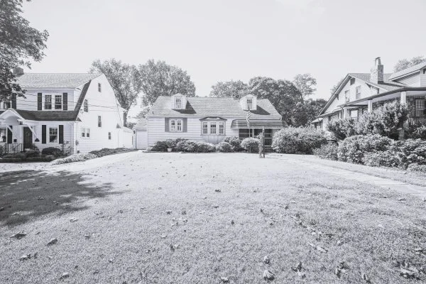
310 9th Avenue before renovation — the cape cod massing, the stone path her father had laid, and the small screened entry enclosure that started everything.

The house at 310 9th Avenue was a 1950s cape cod — modest, well-loved, and showing its age. The screened enclosure at the front entry was barely more than a screen infill around the covered stoop. Inside, the plan followed the cape cod type: the screened enclosure opened into the living room, which connected to the dining room, which connected to the kitchen — all three running left to right across the front of the house. Two bedrooms occupied the rear, sharing one bathroom. The stairs to the unfinished attic sat toward the center of the plan. The attached garage pressed along the left property line.
The rooms were compartmentalized and dark. There was no connection between the living spaces and the rear yard. The kitchen was a closed room at the end of a sequence with nowhere to go. The attic was boxes. And nothing — except that small front porch — connected the house to the life Janice intended to live in it.
From the driveway — the attached garage consuming the left side of the property, the cracked asphalt the dominant feature of the approach.

The original living room — the first room you entered from the screened porch. Closed off on all sides.

The dining room — art already on every wall. Janice was living with serious artwork in a house that couldn't hold it properly.

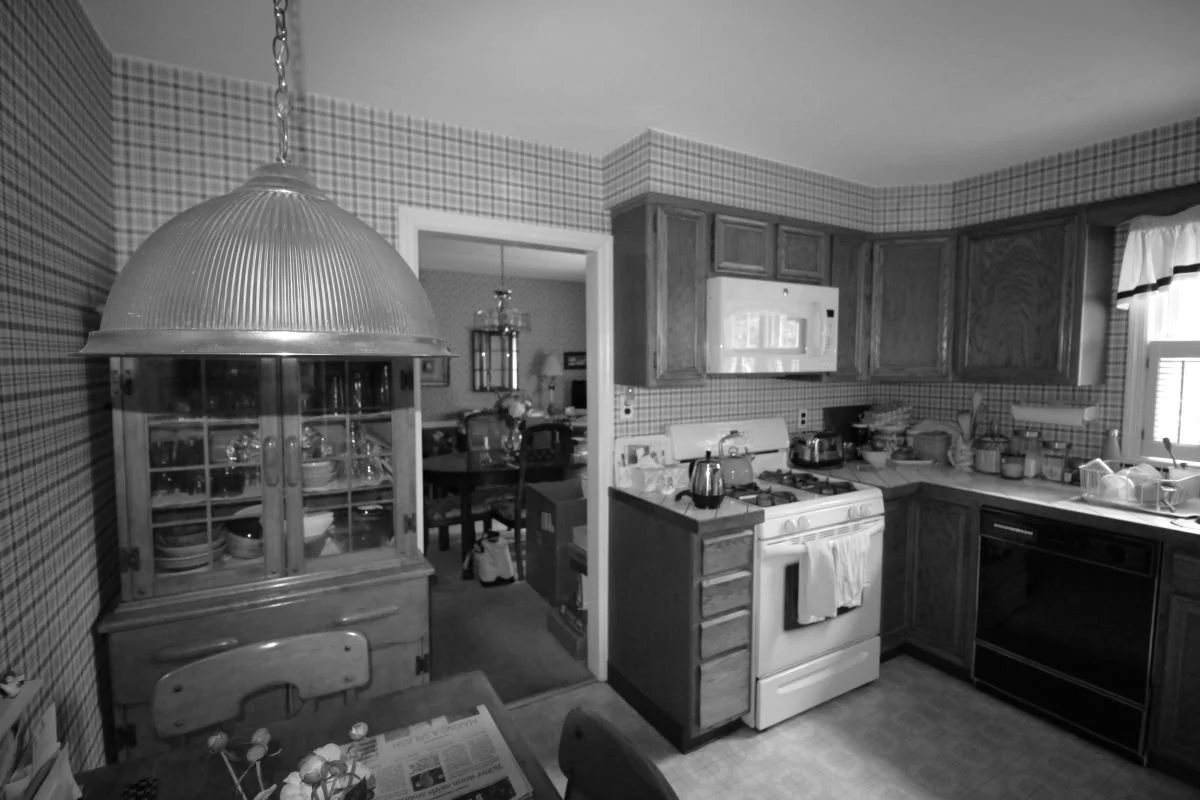
The kitchen — closed, isolated, plaid wallpaper floor to ceiling, with nowhere to go.
That last image says something important. Janice didn't come to this project as someone who wanted to add art to her life. She was already living with it — a significant portrait, a Milton Avery in the bedroom, sculpture on every surface. The house was working against the art, and the art was working against the house. The renovation would need to resolve that.
Then there was the attic.

The stair to the attic — steep, dark, and lined with boxes. This became the stair hall with glass railings and a sputnik chandelier.

The one bathroom for the entire household. The renovated home has 2.5 baths, including Janice's primary bathroom where she was inspired by Mies van der Rohe’s Barcelona Pavilion.
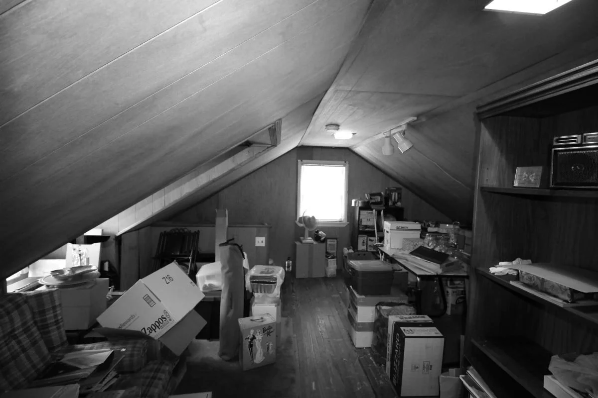
The unfinished attic — low ceilings, two dormers, decades of storage. This became Janice's artist studio.
THE WORK
What happened next wasn't a renovation in the conventional sense.
Haddon Heights zoning does not permit attached garages — the garage had to go, rebuilt as a detached structure with a minimum ten-foot separation from the house. When the scope of what Janice needed became clear, the decision was made to take the house down to its first-floor framing. Walls, roof, second floor — all removed. What remained was the foundation, the floor system, and one original gable end still standing with a temporary brace. From that point forward, everything was built new around the bones of the original structure.

December 2019 — the house reduced to its foundation and first floor framing. The last original gable end standing with a temporary brace. Janice is standing where the garage used to be. This is where the project actually started.

March 2020 — the house and detached garage framing simultaneously. Two separate structures. The rear yard opening between them for the first time.

April 2020 — the garage taking shape at the rear of the lot. The yard between it and the house open and finally usable.

April 2020 — Janice in front of the porch deck, the framing up around her. The roofline her father's house never had taking shape above her head.
The garage removal wasn't a compromise. It was required by the borough’s zoning ordinance. The benefit? It opened the site, the side yard, the rear, and everything else that followed.
THE EXTERIOR: READING THE NEIGHBORHOOD

The site at 310 9th Avenue — a long narrow lot, the house at the street, the garage pavilion at the rear, the bluestone path connecting them through the garden.
Haddon Heights' 9th Avenue is a block of architectural variety held together by shared scale and shared craft. Victorian, craftsman, colonial, cape cod — the styles differ but the detail level and the relationship to the street are consistent. Every house has a front presence. Every house feels considered from the sidewalk.
The design brief for the exterior was to belong to that conversation without mimicking it. Cedar shake shingles in a weathered gray, a standing seam metal roof accent at the dormer, black aluminum-clad windows, brick veneer at the foundation carrying through from the original house, Boral trim throughout. The massing stays close to the cape cod type — steeply pitched roof, dormers, modest height — while the detailing reads clearly as contemporary. The house got significantly larger, but it does not read as oversized for the block. That restraint required discipline.
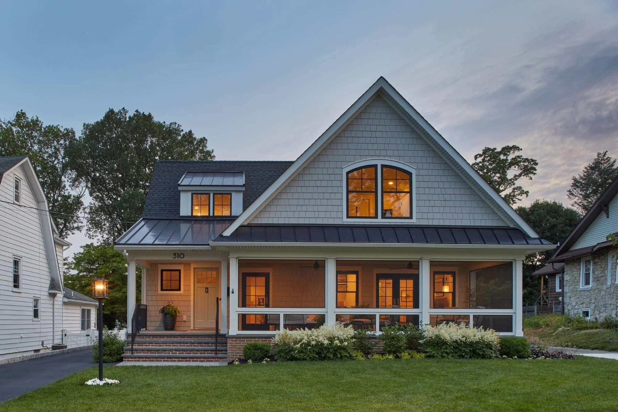
The completed front facade at dusk — the screened porch as the defining element of the design, the cape cod massing updated with contemporary craftsman detailing.
THE PORCH: THE HARDEST DESIGN PROBLEM ON THE PROJECT
Janice knew she wanted a front screened porch before the first meeting. It was non-negotiable and personal — she and her father had loved the small screened enclosure at the entry. She wanted that experience back, at full scale, as a real room.
Front screened porches are almost never done well in New Jersey residential architecture. When they appear, they typically read as additions — boxes attached to the front of a house that interrupt rather than complete the facade. Making one feel intentional required designing from the roofline down, not from the porch up. The porch sits under a low shed roof that reads as an extension of the main roof plane, supported by square craftsman columns, with screen panels set back behind a painted wood frame that gives the enclosure real depth and shadow. From the street, it doesn't look like a screened porch was added to a house. It looks like this house has always had a front porch.

Where it started — the small screened enclosure at the original front entry. This is the memory the new porch was built from.

March 2021 — Janice at her front door, the house nearly complete. The porch she's been waiting for finally there.

Inside the screened porch looking toward the street — the neighborhood framed by the columns and the screens, exactly the way Janice and her father used to watch it.
The porch connects to the house in two ways. A door from the foyer opens onto the entry porch — the everyday passage from interior to porch. And French doors from the primary suite open onto the screened porch, so the bedroom, the porch, and the neighborhood beyond form a continuous morning sequence.
Her father's original front door — carefully removed, refinished by Janice herself, and reinstalled, is the one object in the house that existed before any of this work began.

The foyer — the porch door at left opening to the screened porch beyond, her father's refinished front door centered, the stair at right. Three connections in one room.

The entry sequence — brick steps, craftsman columns, the front door, and the screened porch to the right.
The screened porch is an homage to Janice's father. It is her favorite place in the house. It took more design work than any other single element on the project.
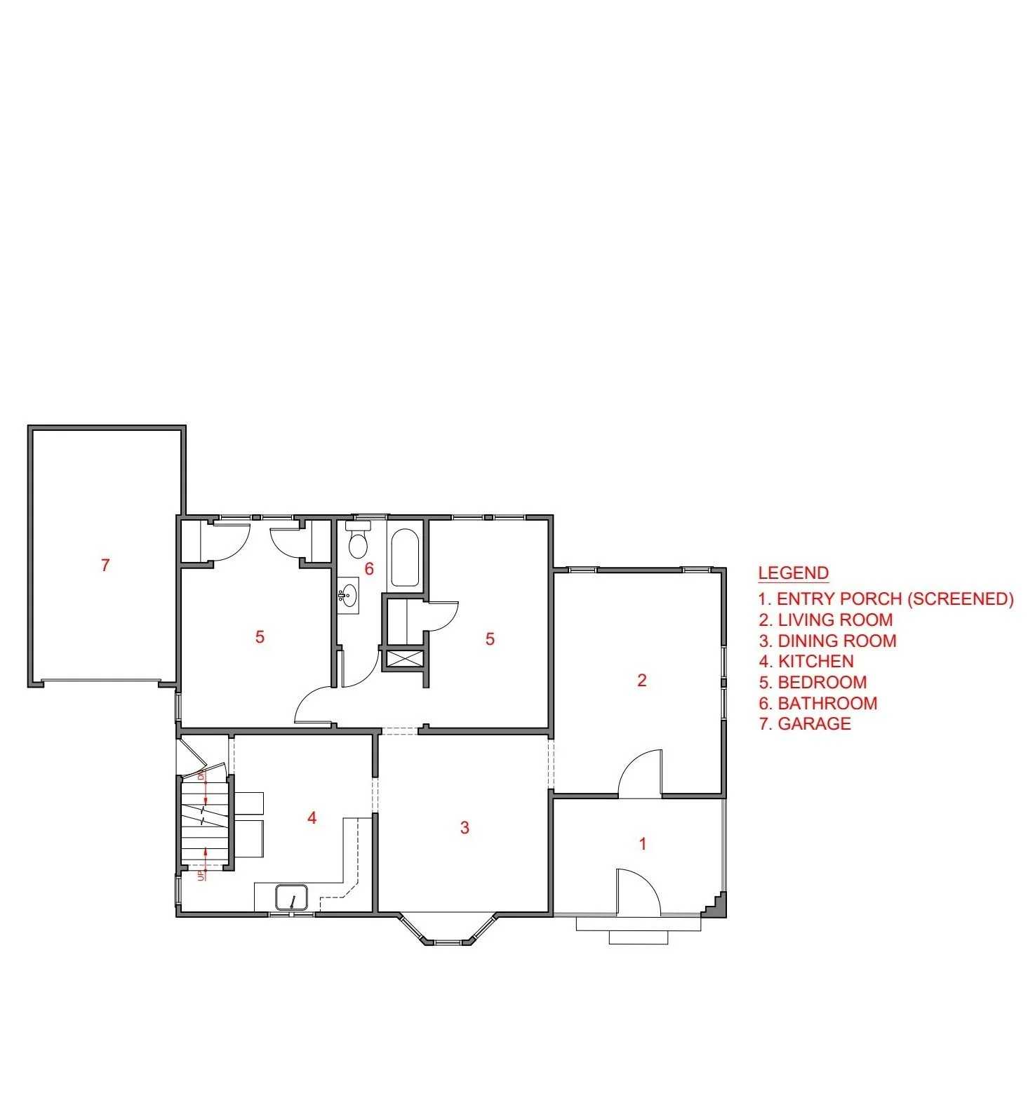
THE PLAN: WHAT CHANGED AND WHY
First floor — before. Seven spaces.

First floor — after. Seventeen spaces. Every one traceable to a specific decision about how Janice actually lives.
The original plan was organized around a different era of living — compartmentalized rooms, a closed kitchen, bedrooms tucked at the rear, stairs to a storage attic. It had no relationship with the rear yard, no room for art, and no accommodation for aging in place.
The after plan reorganized the entire first floor around how Janice actually lives.
A primary suite was created on the first floor. This was the aging-in-place anchor from which everything else followed. The suite sits at the front right corner, with French door access to the screened porch. Locating it on the main floor means Janice never needs stairs to reach her bedroom, bathroom, or the outdoor space that matters most to her.
The gallery hall was created. The renovation widened and formalized the central circulation into a hall five to six feet across — proportioned for display, wide enough to pause in, running from the foyer to the family room. This is the interior spine of the house. It is not a hallway.
The kitchen was reconfigured and connected. Opened to the family room and connected directly to the new side entry drop zone. The path from driveway to kitchen is now uninterrupted — park, enter, drop things, cook.
A powder room was added and the laundry was relocated to the first floor — both in service of a complete life on one level, if and when that becomes necessary.
The screened porch claimed the entire front right of the house — a full room connected to both the foyer and the primary suite.
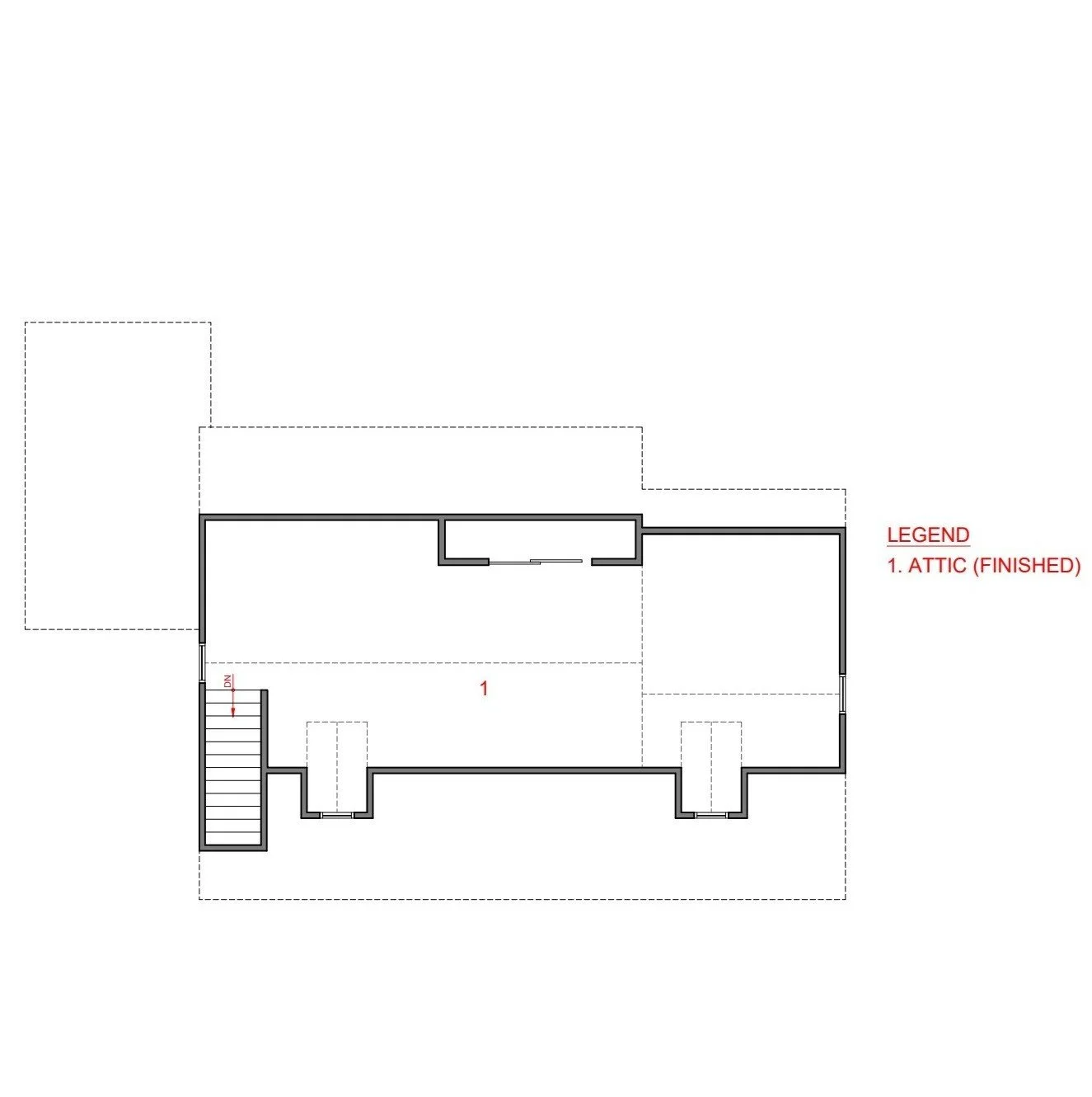
Second floor — before. Unfinished attic, no program.
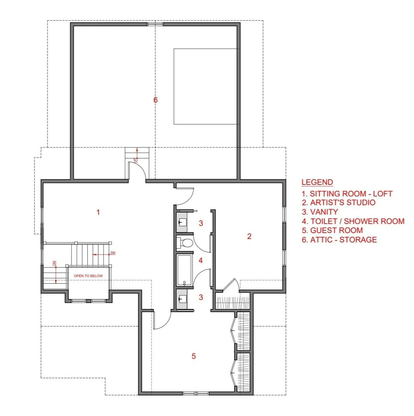
Second floor — after. Sitting room loft, artist studio, guest room with split bath.
Upstairs, the unfinished attic became three real rooms: a sitting room loft open to the foyer below, Janice's artist studio, and a guest room with a bath split into separate vanity and toilet/shower rooms. The studio was the primary reason to finish the second floor. It needed separation from daily life and enough space to work in.
The studio and guest room were not photographed at the owner's preference. The plans tell that story.
THE INTERIOR: A HOUSE SHAPED BY ART

Interior design discussion — Jay walks through the gallery hall, the stair, the kitchen, and the decisions behind each space. An unscripted conversation. Opens in YouTube.
Janice doesn't just collect art. She makes it. That distinction shaped the interior from the first conversation. A house for a collector needs walls in the right places. A house for an artist needs a studio, variable light through the day, and spaces that feel alive when empty — because an artist is often alone in the house, and the house needs to hold that comfortably.
The gallery hall resolves both. It is the widest interior circulation space in the house, lined with display surfaces — for art, books, sculpture, objects — on both sides.

The gallery hall looking from the dining room toward the side entry — the full spine of the house visible in one frame. Dining room at left, kitchen at right, side entry door straight ahead.

Before — the original narrow hall to the rear bedrooms. This is the spatial condition the gallery hall replaced.

After — the gallery hall looking toward the foyer. Wide enough to pause in. Proportioned for display on both sides. Not a hallway. A room you move through.
The foyer opens into the gallery hall. The dining room opens off it to the left. The family room opens at the far end. The screened porch door is visible from the kitchen. At any point in the house, you can see where you are in relation to everything else.
The stair is transparent. Clear glass panels replace the solid balustrade that would have been the traditional choice — not because glass is contemporary, but because Janice's art hangs on the wall behind the stair, and a solid rail would have blocked it.

Looking up through the stair hall — light and art moving freely between floors. The sputnik fixture is the one moment of deliberate visual drama in an otherwise restrained interior.

The built-in bookcase — art books, sculpture, and objects living together. A house for someone who makes things and reads about making things.
Before — closed, isolated, with nowhere to go.

Display integrated into the architecture of the gallery hall — not a shelf added to a wall, but a niche designed into it.

The family room — the tray ceiling holds the space without a wall. The rear glazing and sliding doors open directly to the bluestone patio and the yard beyond.

After — windows that make the morning light a daily event, and a view to the trees and the garage pavilion beyond.
Spaces are open to one another yet clearly defined — expansive and cozy at the same time. That balance was the interior design target throughout.
AGING IN PLACE, INVISIBLY
From the first conversation, Janice was clear: she intended to stay in this house for the rest of her life. That meant planning now for conditions that might be thirty or fifty years away, without making the house feel designed for a future version of Janice rather than the one who lives there today.
Every aging-in-place decision in this house is also just good architecture.
The primary suite on the first floor means Janice never needs stairs to reach her bedroom, bathroom, or the screened porch. The gallery hall, which connects to all the living areas, also connects to the primary suite, which is then connected to the screened porch — when all of the doors are open the house flows without interruption. This works as a design move today and as an accessibility move whenever it needs to be.

The primary suite on the first floor — French doors open directly onto the screened porch. The bedroom, the porch, and the neighborhood form a single morning sequence, all on one floor.
Janice's primary bathroom was inspired by Mies van der Rohe's Barcelona Pavilion — stone floors, reflective surfaces, materiality over ornament. The zero-threshold shower requires no modification to become fully accessible. Remove the glass door if needed someday and the space comfortably accommodates an attendant. Today it reads as a design choice — a clean, open shower with no curb — because it is one. The accessibility planning happened first. The design resolved around it. That is exactly how aging-in-place architecture should work.

After — stone, walnut, natural light. The Barcelona Pavilion as a reference point for a bathroom designed for the long term.
The raised bluestone planter at the rear terrace sits at a height that works for gardening now and from a seated position later. Janice grows herbs for the kitchen and flowers for the yard. The planter was designed for her today, with her future in mind.

The rear at dusk — the raised planter in the foreground, the family room glowing beyond, the red painting visible through the glass. The garden and the art in the same frame.
None of these decisions announce themselves. They are simply good architecture that happens to age with its owner.
THE RESULT

310 9th Avenue — completed November 2021.
Family homes are often renovated until the memory is gone — stripped, expanded, and updated without asking what should remain. This one was different.
Janice came to this project with affection for what the house had been and a clear need for it to support the life ahead: art, gardening, cooking, aging in place, and a quiet front porch for watching the world go by. From December 2019, when the house came down to its foundation in winter light, to November 2021, when she walked in through her father's refinished front door — the project was always about that. About her.
Every decision is traceable to a conversation with Janice. That is what custom residential architecture is for.


